Posts tagged social networking
The World According to Facebook
Feb 24th

(Click on the image for original version).
I have only just come across this image, reported on by the BBC last December, based on a blog post by a Facebook intern. It has been produced using actual Facebook data. Each line links pairs of ‘friends’. Brighter lines indicate more ‘friends’ between two given cities.
The dark spaces, where Facebook connections are relatively absent, are as interesting to note as the bright areas where the number one social networking site has proliferated.
It calls to mind the now classic image of the Earth’s lights at night based on NASA satellite imagery, although Eastern China and Western Russia, for example, are far more luminous in that particular image …
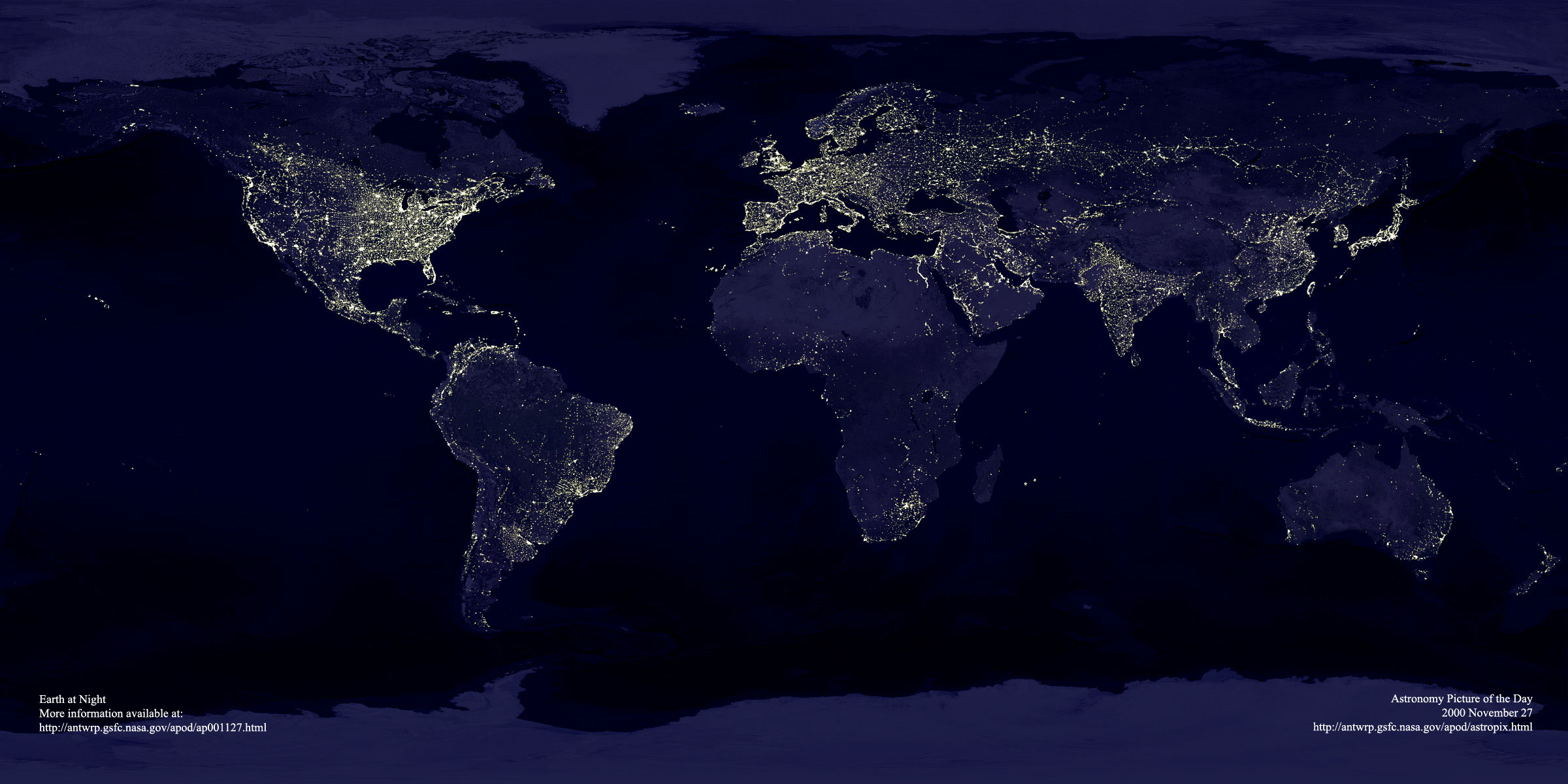
(Click on image for original version. Source: NASA)