Tariffs, Quotas and Subsidies
These three types of protectionism have pretty tricky diagrams (or at least they can get tricky if we want to really get into how they work in terms of the impact they have on different groups or stakeholders. Note – we should want to get tricky if we want to do well at IB Economics ![]() ). Here is a round up of resources to help you understand their effects.
). Here is a round up of resources to help you understand their effects.
Remember to first find a good working definition of each of these types of protectionism. Go on … Google them ![]()
An overview of the three types is here, although the ‘Next’ function does not work.
There is an excellent summary of the relevant theory here by Evan Schmidt on his impressive blog (http://schmidtomics.blogspot.com/)
Tariffs
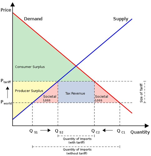
Here’s what a diagram might look like. It gives a good idea of the complexity of the diagram:

Image: Some rights reserved by Gaynoir_
However, I recommend you refer to ‘welfare loss’ instead of ‘societal loss’ – whatever the term you use, these pink triangles represent inefficiency. I also recommend you use letters for the different ‘shapes’ rather than colours, as that is far more efficient to complete in an exam and to refer to in your text which you use to explain the diagram. This diagram below uses letters, but note, you can (should) still get even more sophisticated than this – check your IB Economics text book if you have one.
Image by Ratibgreat on wikipedia
This first video by lostmy1 is a simple explanation compared to the following videos, but it is very accessible. It does not tackle efficiency / consumer and producer surplus, and these are concepts which you should then try to understand from the subsequent videos.
This next video by economicsfun is a very good explanation. The second half moves on to analysing in terms of theoretical numbers, which would not be necessary in an IB Economics essay – but being able to identify the different ‘shapes’ which the author colours in would be ideal if you used a lettering system (as is likely to be the case in your text book).
This video by pajholden can not be embedded, but is worth hitting the link below for a further explanation:
tariffs and protectionism by pajholden
Probably the best of the bunch, MechamDee gives us a video with quiet audio, but it is thorough, starting off with the effect of trade compared to non-trade and then moving onto the impacts of tariffs. He gets in to detail with the different ‘shapes’ as letters, although the image itself is small and not so easy to see. It is very well explained though:
These interactive presentations by http://www.reffonomics.com are particularly useful for checking your understanding:
Finally economicslessons give us a slick (and silent) animation that summarises the different effects well, but you’ll definitely want to pause this as you go along to take it in properly:
Quotas
This a particularly tricky one to revise form the internet as there are different, conflicting explanations of how a quota works in an internationally competitive market. For IB Economics, you want the diagram that shows effective supply to be a ‘kinky’ supply curve.
MechamDee gives another thorough explanation, with useful demonstration of the ‘effective’ (or ‘kinky’) supply curve.
Subsidies
What, no videos? No interactive tutorials? Sorry! Who is going to be the first to make one?
Correction: I have found an excellent video analysing the impact of a protectionist subsidy by http://welkerswikinomics.com (welkerjason):
See the full post for some accompanying questions:
Calculating the effects of protectionist subsidies – an IB HL exercise
Anyway, For additional best IB-level information on this, visit the schmidtomics link at the very top of this post, or consult your IB Economics text book!
| Print article | This entry was posted by James Penstone on October 23, 2011 at 8:04 pm, and is filed under Economics, IB Economics. Follow any responses to this post through RSS 2.0. You can leave a response or trackback from your own site. |


