James Penstone
This user hasn't shared any biographical information
Posts by James Penstone
Resources to Help Learners Understand the 2011 Tohuku Earthquake and Tsunami
Mar 19th
Almost all of these resources have been linked to by educators using Twitter, and should help learners to deepen their understanding of the disaster that occurred on 11th March 2011, and its aftermath.
Note on reliability: These resources were collected here on 20th March 2011 and so only include information available on or before that date – learners are advised to research for the latest updates as well, as the situation reported on in these links is always changing and a lot more information continues to be made available.
Excellent slideshow by Simon Jones providing questions to prompt thoughtful reflection by students learning about the disaster:
How Shifting Plates Caused the Earthquake and Tsunami in Japan: Interactive map by The New York Times helps explain the tectonic causes of the earthquake and tsunami.
Japan Earthquake 2011 Google Map provided by Google with many possible placemarks to explore on the left side of the map.
For Google Earth – ‘post-event imagery of several affected areas in Japan’ [View these files in Google Earth]
Striking before and after satellite imagery of various locations in North Japan hosted on the NY Times. Drag the slider from left to right and back to see the differences. A similar resource has been posted by the Guardian.
In pictures: Japan earthquake and tsunami – slideshow hosted on BBC website
Slideshow – Seven Days in Japan – 70 photographs each with a caption underneath.
Japan: the day after the earthquake and tsunami – in pictures – slideshow hosted on the Guardian newspaper’s website.
Factbox: Japan disaster in figures – published by Reuters on Saturday 19th March.
A graphic representation of the earthquake and resulting tsunami – useful to understand the causes. Provided by the National Post.
2011 Tōhoku earthquake and tsunami – Information collected on wikipedia.
Interactive map by the Guardian’s website, as at 16th March 2011 (note: information on nuclear risk likely to change quickly – learners are advised to research for the latest updates on this, as the situation has been continually changing).
JPquake Journalist Wall of Shame – Interesting ‘crowd-sourced’ wiki created by people concerned that some reports on the disaster contained bias, speculation, misinformation and sensationalism. This could be interesting to students of IB Theory of Knowledge, as well as other subjects.
100+ Teaching Resources About The Japan Crisis by edudemic.com – Several resources linked to above are also included in this very useful collection. The collection also provides a lot more links on the science behind the disaster.
A powerful video created by students at Yokohama International School:
Tohoku Japan Earthquake Awareness from 12ShirotsukaM on Vimeo.
The NY times has invited teachers to share ideas on how they and their students have been responding to the disaster. Recommended.
Japan Quake Map – Based on Google Maps, this is revealing, dynamic time-lapse map shows the sheer volume of seismic activity (earthquakes, pre-shocks and aftershocks) around North Japan beginning on the 11th March to current date (true at 31st March when this was updated).
Japan’s Earthquake & Tsunami: How They Happened – via openculture.com, a link to an informative 47 minute documentary

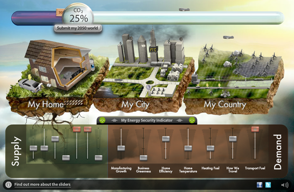
Can you drastically cut UK carbon emissions by 2050?
Mar 9th
Could you take charge and organise changes in production and consumption to cut UK CO2 production in 2050 to 20% of 1990 levels?
This excellent interactive decision making exercise asks you to do just that. It has great potential in geography, economics, environmental science and more.
Interestingly, if you get it right (succeed in hitting the 20% target or lower), you can submit your ‘decisions’ and the Department of Energy and Climate Change will combine your data with all other submissions to help inform a debate about the kinds of “choices and trade-offs the United Kingdom faces to reach the 2050 emissions reduction target”.
Hit the link below:
Thanks to my friend and former colleague, Andy, for passing this my way.
Market Failure
Mar 8th
Introduction to Market Failure
Let’s kick off with mjmfoodie:
economicshelp gives us this video:
Another simple overview of how markets fail for merit and demerit goods (S and D curves used)
BrynJonesOnline:
More complicated overview of market failure using concept of marginal costs and marginal benefits.
richardmckenzie covers welfare loss and briefly introduces solutions at end.
(1 of 2)
(2 of 2)
Externalities
From mjmfoodie:
Follow this link:
http://www.youtube.com/watch?v=S0lH4GEFy1o
Simple Overview of how markets fail for merit and demerit goods (S and D curves used) by BrynJonesOnline
Lighthearted and simple overview of some solutions to negative externalities by ASEconomics
Some student work on the topic:
Public Goods
by mjmfoodie

How Long Should You Spend On the IGCSE Economics Paper 2 Questions?
Mar 8th
A very important key to exam success is to get the timings right.
Timings can go wrong in two ways:
- You spend far too little on all questions and have time to spare at the end. If you spend a lot of time doing nothing in your exam, this has a serious ‘opportunity cost’ …
- You take too long on earlier questions, so you don’t leave enough time at the end for later questions and lose valuable marks on these.
You need to use the clock (and a bit of quick mental maths) to your advantage.

Image: Some rights reserved by bastique
Timings
Paper 2 lasts 2 hours.
You have 4 main questions to answer.
You really should stick to 30 minutes per main question.
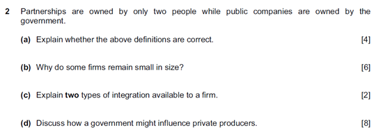
Each main question is worth 20 marks and is made up of smaller questions. Look at the example below from the specimen paper:
Source: University of Cambridge International Examinations – IGCSE Economics Site
Direct link to specimen paper here
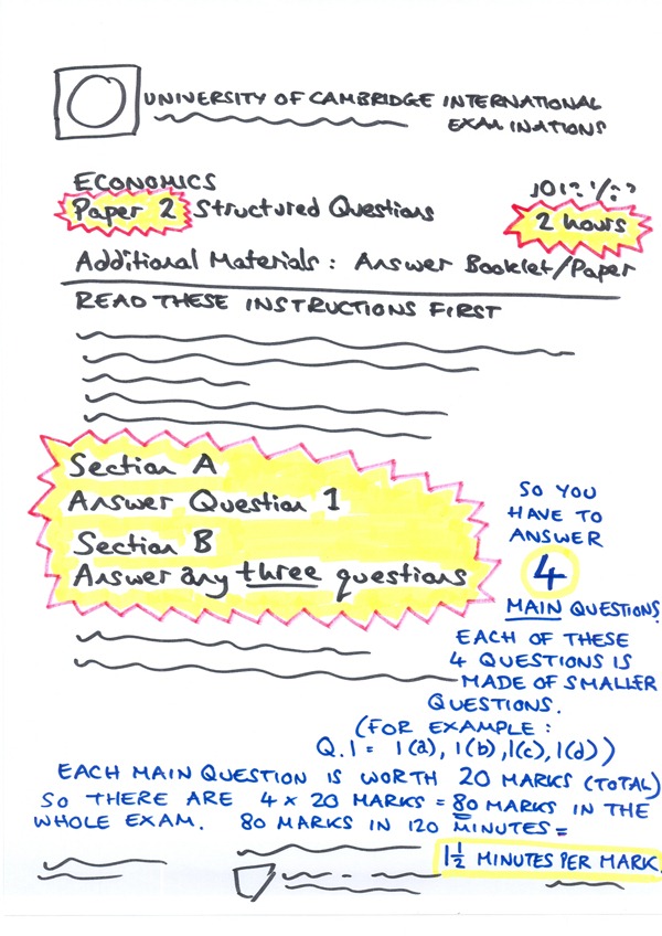
Very important: Section B has 6 main questions to choose from but you only answer 3 of them (giving a total of 60 marks for section B).
You must also answer Question 1 in Section A (worth 20 marks).
The graphic below is a mock up of what the front page of the exam looks like. Check the specimen paper (or any other paper such as the past paper also hosted on the website given above). This graphic highlights the key bits for timings and the words in blue help explain why each mark has one and a half (1.5) minutes for you to spend on it.
You should get in the habit of seeing how many marks a question is worth and then quickly calculating how many minutes you should spend on it. Keep an eye on the clock.
So a smaller 6 mark question deserves 9 minutes of exam time.
Please note that 1 and a half minutes per mark includes reading and checking time.
The shorter 2 or 3 mark questions probably will not need the full 3 or 4.5 minutes. These are often definition questions. They might only take one minute to answer, so you ‘save’ something like two minutes from these questions for your overall reading and checking.
The longer questions 4, 6, 8 or 10 marks (for example) should get their full time from you. So aim to spend a full 6 minutes on a four mark question, etc.
At the very least, stick to timings for the main questions:
Each main question (worth 20 marks each in total) deserves a full 30 minutes from you – no more and no less.
The best way to get all of this is simply to practice past paper questions as often as you can while sticking to the timings. If you do this, you’ll soon get a fell of how much you should be writing on different length questions.

The World’s Most Typical Person
Mar 7th
The world’s most typical person is male and in terms of the mode average ethnic group, is a Chinese, Han man. His age, in terms of median average is 28. The typical face shown above is built of 190 000 photos of 28 year old ethnic Han men. But as the video tells us, he won’t be the most typical person for long …
As World Population approaches 7 billion, NationalGeographic have created a brilliant infographic-style animation, complete with catchy tune and thought-provoking statistics. (There’s also a healthy qualifier in there – “typical is always relative”).
A great starter for population studies or even for discussions about global inequality, like the World Scaled Down to A Village of 100 idea. It might also have value in Theory Of Knowledge discussions of data and what we mean by ‘typical’ and ‘ethnicity’. There’s even a bit relevant to the economic concept of ‘needs and wants’ at the very end.
Packed full of cross-curricular uses, it is simply a ‘must see’.

Visualising the Iceberg Model of Culture
Mar 5th
One of my current roles in my school is to lead a group of staff who are interested in exploring the significance of interculturalism within our school community, and to explore ways of furthering intercultural education and sharing relevant best practice.
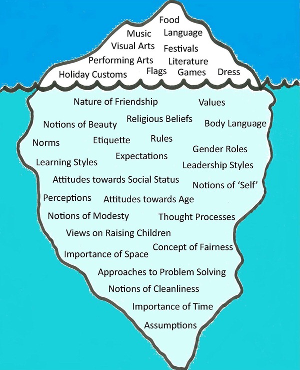
This has led me to creating the following image. It is based on work originating in the 1970s by cultural / social anthropologists and, soon after, business theorists and there are many similar images on the Internet. I wanted to create a ‘fresh’ version so that I could release it on a Creative Commons License, one that could be freely shared amongst those who find this particular model of culture useful. (Many related images seem to be copyrighted, sometimes because they have used a copyrighted image of an iceberg).
The idea of culture as an iceberg is simple but powerful when reflecting on how a school could actively promote intercultural education. We readily identify with the more ‘visible’ and ‘obvious’ aspects of culture, and so recognise where we celebrate these aspects within the school programme. However, for genuinely meaningful intercultural education to take place, the whole school community needs to reflect on and learn about the less tangible but no less important ‘invisible’ aspects as suggested below the waterline in the image below. Crucially, the cultural aspects on the visible part of the iceberg are influenced by the sub-surface values, beliefs, notions, attitudes and assumptions.
I will post the same image and related links on my school’s interculturalism blog: http://interculturalism.blogspot.com/.
Click on the image for a larger version.
 |
The image by James Penstone is licensed under a Creative Commons Attribution-NonCommercial-ShareAlike 2.0 UK: England & Wales License. |
Inspiration:
The iceberg model of culture has been arrived at through the work of many theorists, including those referenced below:
French, W., & Bell, C. (1995). Organization development. (5th Ed.). [Englewood Cliffs, NJ: Prentice-Hall International]
Hall, E. T. (1976) Beyond Culture [New York: Doubleday]
Selfridge, R., Sokolik, S. (1975) “A comprehensive view of organizational management”. MSU Business Topics, 23(1), 46-61
Weaver, G. R. (1986). “Understanding and coping with cross-cultural adjustment stress”. In Paige R. M. (Ed.), Cross-Cultural Orientation, New Conceptualizations and Applications. [Lanham, MD: University Press of America]
Price Discrimination
Feb 28th
The first video in this post goes to a student. Komilla (CuteChadz)has produced a very professional looking summary and it is well worth a look:
pajholden does price discrimination
richardmckenzie gives us two videos:
Click here to see a Reffonomics interactive presentation on price discrimination.
For a bit of fun, view the scene from the Monty Python film ‘Life of Brian’ where confusing haggling (first price discrimnation) takes place – click here.
The World According to Facebook
Feb 24th
(Click on the image for original version).
I have only just come across this image, reported on by the BBC last December, based on a blog post by a Facebook intern. It has been produced using actual Facebook data. Each line links pairs of ‘friends’. Brighter lines indicate more ‘friends’ between two given cities.
The dark spaces, where Facebook connections are relatively absent, are as interesting to note as the bright areas where the number one social networking site has proliferated.
It calls to mind the now classic image of the Earth’s lights at night based on NASA satellite imagery, although Eastern China and Western Russia, for example, are far more luminous in that particular image …
(Click on image for original version. Source: NASA)
Oligopoly
Feb 21st
IB Syllabus requirements:
• Assumptions of the model
• Collusive and non-collusive oligopoly
• Cartels
• Kinked demand curve as one model to describe interdependent behaviour
• Importance of non-price competition
• Theory of contestable markets
BrynJonesOnline introduces the theory before moving onto Kinked Demand Theory:
Cartels
This helpful video is by richardmckenzie
Non Collusion – Kinked Demand Theory:
An animated slideshow on oligopoly focuses on kinked demand theory (from the excellent Reffonomics ).
The above introduces the ‘kink’ (by ACDCLeadership). The below is by pajholden and goes into more detail:
kinked demand curve theory (click on the link to view)
The kinked demand theory can be extended to show how such a non-collusive oligopolistic firm makes a loss, makes a profit or breaks even (again from the excellent Reffonomics ).
Theory of Contestable Markets
pajholden discusses the theory in his back garden: contestable market theory
economicslessons has produced this video geared towards A Level economics (so the example question at the end is not an IB one):
Extra:
On the interdependency of firms, we should consider John Nash who arrived at the theory of a Nash Equilibrium in which members of a group would serve their own interests by also serving the rest of the group’s interests (as opposed to Adam Smith’s contention that individuals (or firms) will strive to serve their own interests only). This idea was captured in the excellent film A Beautiful Mind and the relevant excerpt can be seen by clicking here.
On the difficulty of drawing a line between monopolistic competition and oligopoly, view this slideshow by Reffonomics.
Finally, for a bit of fun, see how a famous condom manufacturer has approached non-price competition through the power of advertising by clicking here.
Developed and Developing Economies – Online Resources and Revision Materials
Feb 21st
The full title of this section from the IGCSE syllabus is:
‘Developed and developing economies: trends in production, population and living standards’
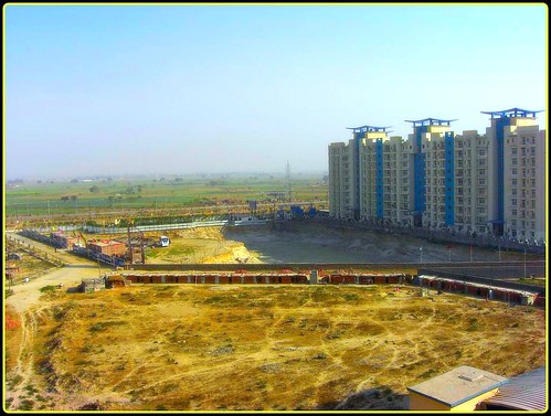
Image: Some rights reserved by souravdas
Here is what the syllabus requires of us:
Candidates should be able to:
• describe why some countries are classified as developed and others are not;
• recognise and discuss policies to alleviate poverty;
• describe the factors that affect population growth (birth rate, death rate, fertility rate, net migration) and discuss reasons for the different rates of growth in different countries;
• analyse the problems and consequences of these population changes for countries at different stages of development;
• describe the effects of changing size and structure of population on an economy;
• discuss differences in living standards within countries and between countries, both developed and
developing.
![]() There is a lot of overlap between this section of IGCSE Economics syllabus and the Geography (I)GCSE – if you are studying that subject, you will be able to use some of your Geography notes and resources too. Some of the websites given below are Geography revision pages.
There is a lot of overlap between this section of IGCSE Economics syllabus and the Geography (I)GCSE – if you are studying that subject, you will be able to use some of your Geography notes and resources too. Some of the websites given below are Geography revision pages.

Some rights reserved by godwin d
a) describe why some countries are classified as developed and others are not;
Quite a detailed, interactive site: http://bbc.in/hZmNJh
Note: development is bigger than economci growth. Think of economic growth as a key ingredient of development, a sub set of development. This video by geographyalltheway shows us that development can mean a lot of things:
b) recognise and discuss policies to alleviate poverty;
Aid
Fair Trade
mobiuslive posted an excerpt video from eq.tv on fair trade:
And DiagramConsultores gives us this video on Fair Trade in the Domincan Republic:
Microfinance
Video from Opportunity International:
WorldBank provides an example from Mauritania:
c) describe the factors that affect population growth (birth rate, death rate, fertility rate, net migration)
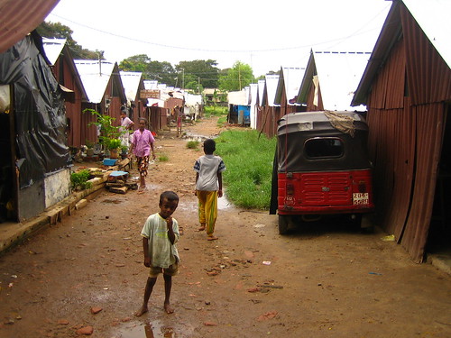
Image: Some rights reserved by Aidan Jones
d) discuss reasons for the different rates of growth in different countries;
e) analyse the problems and consequences of these population changes for countries at different stages of development;
cheergalsal offers this summary of the Demographic Transition Model:
And geographyalltheway gives us this animated explanation:
http://bbc.in/htA601– and follow the links to the pages that follow this first one
Test your understanding here: http://bit.ly/g9Spcs
f) describe the effects of changing size and structure of population on an economy;
g) discuss differences in living standards within countries and between countries, both developed and developing.

Source: http://www.mint.com/blog/trends/mint-map-global-wealth-distribution/
