The Long-Run: Cost Curves, Economies and Diseconomies
Jan 17th
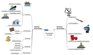
www.bized.co.uk provides some useful materials for this topic. The starting point is their mind map. Click below to view the mindmap on its original site and in full.
A very useful MS powerpoint file, also courtesy of www.bized.co.uk, to expand on teh above mindmap can be accessed here:
pajholden gives an overview in 8 minutes:
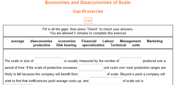
Check your understanding of the different economies of scale using this simple interactive test from www.dineshbakshi.com (click on it):
Once you have learned about the different Economies of Scale, attempt to create a detailed revision diagram by clicking here:
A very detailed analysis by richardmckenzie of how the long run cost curve can be built up of multiple short run cost curves. He also includes the long run marginal cost curve:
This video (with very quiet audio – you will need to turn the volume up) explains the overall shape of the LRAC (Long Run Average Cost) curve with labels but it is simpler as it does not include the SRAC curves.
Now, could you identify economies of scale on a diagram? Pause this video at the start and see fi you can answer it before the commentator gives the answer:
Profit
Jan 13th
We need to understand this according to the syllabus:
- Distinction between normal (zero) and supernormal (abnormal) profit
- Profit maximization in terms of total revenue and total costs, and in terms of marginal
revenue and marginal cost - Profit maximization assumed to be the main goal of firms but other goals exist (sales volume maximization, revenue maximization, environmental concerns)
First review the difference between normal and supernormal (or abnormal) profit explained in this video by mjmfoodie:
Then, mjmfoodie also introduces us to profit maximisation “in terms of total revenue and total costs, and in terms of marginal revenue and marginal cost” (IB Economics syllabus):
The MC=MR is a golden rule which you really need to understand and remember. See it action in this fast-aced example by ACDCLeadership:
For a light hearted recap, SpongeBob Squarepants and Mr Crab discuss these principles (thanks to EdwardBahaw):
We must remember however, that profit maximisation is assumed to be the number one goal of firms. What about other goals?
Research / Discuss what other goals a firm might have – share them with others in your class.
Now, for each of the additional goals, discuss whether or not they in fact do in some way link to profict maximisation.
pajholden demonstrates that the profit maximising level can be different from output maximising level. Watch the video here:
objectives of firms
Top Tips for Tackling IB Economics Internal Assessments (“Coursework”)
Dec 17th
Welcoming further suggestions on this – add to comments, and I’ll update the Google document itself.

Data Response–Champagne, Supply and Demand
Dec 13th
Credit: I came across this useful practice data response question via a student’s blog associated with this teacher’s site: http://www.peteranthony.org/wordpress/
Image: Some rights reserved by epicxero
I think this is an excellent introduction to this 3rd paper which forms part of the IB Economics final assessment. The questions are straightforward, but you will need to pay close attention to the markscheme for these kinds of questions, which usually follow the same format.
1) The article (data to which to respond):
UK Newspaper, Daily Mail, on Champagne price decreases, October 2009
2) The questions
1. Define the following terms: a) demand, b) supply [4]
2. Using an appropriate diagram, explain one reason for why the price of a bottle of champagne has fallen? [4]
3. Using an appropriate diagram, explain one reason for why the price of champagne will probably rise next year? [4]
4. Using information from the text and your knowledge of economics, evaluate a decision not to raise the price of a bottle of champagne over the coming months before Christmas. [8]
Understanding Comparative Advantage
Dec 7th
Having played the desert island game, you should be in a position to develop your understanding of an important economic concept which is used to support international trade. 2 videos should help. The first is a rough-and-ready video with an easy to access example:
Now, MJMFoodie gives an old but polished example, and introduces Adam Smith and David Ricardo’s perspectives on these matters:
Trade Unions
Dec 3rd
The IGCSE Economics syllabus requires you to:
- describe trade unions and their role in an economy;
Watch the following videos and answer these questions:
- What roles do Trade Unions have in the economy – what do they do?
- What are the possible advantages of Trade Unions?
- Detecting bias – Are these videos in favour of unions? or against?
Now research some of the possible arguments against Trade Unions from an economic perspective …

Revenues –Total, Marginal and Average
Dec 2nd
By now you should understand the graphs for
a) Total Product (b) Average and Marginal Product (c) FC, VC and TC (d) AFC, AVC, ATC, MC
You should also recognise the ultimate assumption of firms – profit maximising
Now we turn to revenue.
Image: Some rights reserved by saturnism
You now need to:
- Recap on the difference between perfect competition and monopoly market structures
- Understand the different equations for cost and the equations for calculating revenue
- Understand the behaviour of revenue for a monopoly (a price giver acting in imperfect comp) (this includes relevant graphs, trends of graphs and explanations (you might also possibly recognise the role of elasticity)
- The same as above, but for Perfect Competition
- Understand the purpose of studying revenue and how relates to previous learning on output / product and costs
First of all, recall the main differences between monopoly and perfect competition:
Now make sure you know the Golden Equations – complete this work sheet before moving on:
Golden Equations MS Word version
Golden Equations Google Doc version – make your own copy before you can edit
Now attempt to complete this spreadsheet worksheet. Take your time – work through it slowly and deliberately. There are two tabs to complete, one for monopoly situation (first) and one for perfect competiton. You might like to research a little to help give as full answers as possible for the text boxes.
Once you have checked through your answers to the above, you can review your overall understanding with this video:
Revenue Curves For Firms by pajholden
Finally, you should practice drawing the curves you have learned using the activities above and then try to annotate them with their key features and explanations
The World Scaled Down to A Village of 100
Nov 28th
Just came across this video, based on what is now a widely-read summary of some key demographic and economic statistics. These statistics do need to be verified, as the opening shot states, if not for any other reason than the age of the data. This notion of the world as a village of 100 (and the associated data) first emerged in the early 1990s.
As David Truss argues, this could be really useful for cross-curricular discussion. I’ve used the Village of 100 idea a few times – in Geography, Economics and as part of an assembly. I first received an email with this idea in 1998, and used some of it when visiting a Secondary School in southern Ghana in 2003. Teaching a Geography class of nearly 70 students, I tried to apply the same concept for some of the issues covered by asking the appropriate proportion of the class to stand up. The Ghanaian students were blown away by the proportion of their class that would live in Asia (having guessed Africa and Europe to carry the highest populations, by far). The ICT teacher at that school (who commanded a suite of 16 computers for a school of c. 2,500 students) was fascinated by the internet access statistic.
For another way of visualising global economic inequality (which features in the Village of 100 idea), I highly recommend this website:
Update:
This impressive and simple website helps you to make quick comparisons between your own country and any other – this can call up statistics that call to mind the inequality depicted in the Village of 100. Watch out for the adverts though:
Short Run Cost Curves
Nov 25th
Our eventual aim of this learning session is to understand (and know ‘like the backs of our hands’) the following diagram:

First we need to understand the difference between fixed and variable costs. This video by MJM Foodie handles this well:
This is a very good interactive exercise to consolidate your understanding of the different types of cost, and ends with a graph to show how their ‘curves’ will look. It introduces the idea of marginal costs and links changes in these costs to the theory of diminishing returns – crucial to understanding the shapes of the graphs. Read all of the text and work through the activities from start to end.
http://www.sambaker.com/econ/cost/cost.html
Now MJM Foodie begins to link us to the graphs more directly:
If you need another glimpse of how the product curve ‘translates’ to the cost curve so that the theory of diminishing marginal returns is transferred, see the first few slides of the following (after slide 3 , the slideshow really gets too technical for IB Economics):
http://www.unc.edu/depts/econ/byrns_web/Flash/Chapter_8/8_2.swf
We need to understand and be able to draw the TC, FC and AC curves.
This link helps us understand how to achieve the graph at the top – work your way through these explanations very carefully:
![]() http://www.reffonomics.com/TRB/chapter8/COSTS6.swf
http://www.reffonomics.com/TRB/chapter8/COSTS6.swf
This next link gives a useful summary of the different cost curves, and includes an interactive exercise to check your understanding on Average Total Costs
http://www.kmversteeg.com/mult/9_05.swf
This is very useful for understanding the shapes of each of the cost curves:
Cost Curves Part 2 from reffonomics
Activity 7 here is a very good practical exploration of products and costs using both the EXCEL sheet and the Word Document:
http://www.economicsnetwork.ac.uk/archive/richard_green/
Finally this interactive graph allows you to ‘play’ with the set of cost curves we see in the first image of this post, showing how labour prices and fixed costs can be altered to change the gradients of the graphs, but notice how their overall shapes remain:
http://highered.mcgraw-hill.com/sites/007334365x/student_view0/chapter9/interactive_graph_2.html
Back to MJM Foodie. She explains how we can link from TC, FC and AC to ATC, AFC and AVC curves:
Finally, some more videos (if you need them) to reinforce what you should have learned by now:
Cost Curves for Firms by pajholden


