Output or ‘Product’ in The Short Run
Nov 23rd
a) Find out the definition for the short run (in Economics it has a specific definition).
Use google and the define: prefix.
Image: Some rights reserved by °Florian
b) A practical activity in the classroom.
Rules:
1) A wall in the classroom – you can not move away from the wall, you must always stay right next to the wall. Physical land is fixed.
2) At one end of the wall a desk with a pile of raw-material-paper (or text books).
3) At the other end of the wall a desk. This is where the paper is manufactured into end-of-wall paper once it has been transferred from the other side to this desk.
4) Only one piece of paper can be carries by a worker at a time.
5) We will add more and more workers, but since no-one can move away from the wall, they can not pass each other.
6) Each production cycle (period of time) lasts one minute only.
7) All workers recognise the profit-maximising incentive of working to full ability, and behave accordingly. (No slacking …)
6) First volunteer up. Results will be recorded on a Google Spreadsheet. Access the one below and make a copy of it in your Google Account.
Direct link (make a copy in your own google account): Opengecko Product Exemplified – Carrying Books Exercise
c) Make sure you have thoroughly discussed the graphs – what is happening? Why do they have these shapes?
d) Research (text book and / or web) the definitions of, behaviour of and relationship between the following as the one factor of production (labour) is increased:
- total output [total product]
- average output [average product]
- marginal output [marginal product]
Key phrase: diminishing returns (define and be precise about the full phrase)
e) Review your understanding of the above with the following:

What Are Supply Side Policies?
Nov 23rd
Image: Some rights reserved by Re-Entry One Stop
![]() Here is a simple activity that could be completed as a class.
Here is a simple activity that could be completed as a class.
Visit this site to see a list of 12 supply side policies:
http://www.economicshelp.org/macroeconomics/economic-growth/supply-side-policies.html
In pairs or ones, create a cartoon to explain one policy from the list of 12. Your cartoon should be designed to make the idea easy to understand.
Remember to add speech bubbles and appropriate characters / setting to give the policy some meaning. Add a title that matches the policy itself.
I recommend you use toondoo which is easy to use and quick and free to sign up for.
If you use this particular piece of online software, you can share it as a public comic book so that it can then be embedded on a website.
Looking for an example of toondoo? Here is a great cartoon by my colleague Maree (this one introduces three different economic systems):
‘Eat Local ‘ Government Advertising Domestic Produce
Nov 9th
Why would a government encourage consumers to ‘buy local’?
What impact would this have on the demand / supply diagram for these products?
How could this be considered a form of protectionism?
IB Economics: Why might a government introduce this together with certain price controls (such as a minimum price / Buffer stock programme)?

Introducing the Millennium Development Goals
Nov 7th
What are the 8 Millennium Development Goals? This 30 second video introduces them:
This video includes a bit of a speech by Kofi Annan who was Secretary-General for the United Nations when the Millennium Development Goals which were agreed in 2000 at an important meeting (The Millennium Summit) where a number of world leaders discussed ways to reduce poverty in the world. The images and facts help explain his message:
Another good video to introduce the MDGs:
These slideshows also help explain the 8 Millennium Development Goals:
Now view the fact sheet on the MDGs:
Unicef fact sheet
Here are two quizzes to test your understanding of the MDGs:
Source: United Nations Foundation
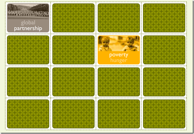
Click below to play a memory game on the Millennium Development Goals:
Source: World Vision
Millennium Development Goal 3
Nov 7th
Watch this video about Millennium Development Goal 3:
These two videos are part of a series by planinternationaltv called ‘Because I am A Girl’ and they tell us about some important facts (statistics) about girls around the world:
A similar video by PlanUSAvideos makes us think by comparing the birthdays of girls in very poor countries to some typical birthdays of girls in USA:
What is the point being made by this video?
A message of hope: The Girl Effect (by girleffect)
Another message of hope in this excellent video by ministerieBZ:

Create an Infographic for Millennium Development Goal 3
Nov 7th
What is an infographic?
It is a visual way of showing information (data) data so that it is easy to understand. They help to explain complicated information clearly and quickly.
An infographic can be a video or a picture (like a poster).
Here is a video infographic explaining the 8 Millennium Development Goals and why we need them. Watch it and notice how simple but good-looking graphics are used to show the information. .
You probably agree that the information can be easier to understand this way than if you were reading it in a piece of text or if you were looking at tables of numbers.
If you want to understand more about the Millennium Development Goals and see more video clips like this, visit this page.
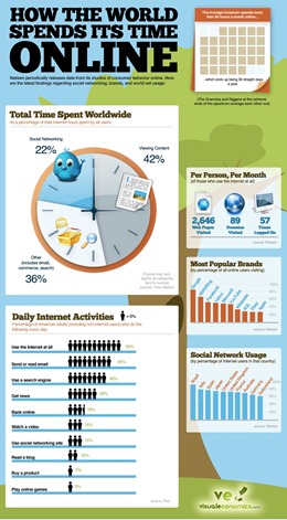
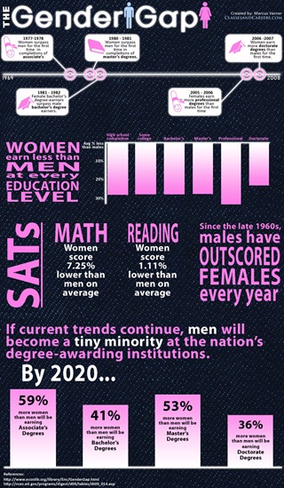
Here are some still-picture infographics which are more like posters. They are not all to do with the third Millennium Development Goal, but they are good examples. Click on them to see bigger versions.
Notice how pictures, colour, numbers, text, graphs and diagrams are blended in a simple to read and interesting way.
Sources: History of Women in Workplace
How The World Spends Its Time Online
Your Task
Your task is to create an infographic which tells people about gender inequality around the world. It probably won’t be as detailed as the ones above (some of these professional infographics take several months to create) but making it should hopefully be an interesting way of understanding some of the facts about gender inequality.
It is recommended that you create graphs using MS EXCEL, using the files listed under ‘Raw Data’ below. Try to make them visually appealing through clever formatting. There is also some interactive software listed below which you could use to make maps (you may need to take screen shots [Print Screen] of the maps once you have created them).
You can find images to help your infographic online. You should always give the sources of images and data at the bottom of your infographic.
It is up to you what software you use to put the images, graphs and text together but I recommend MS Publisher or using just one slide in MS Powerpoint (this is probably the simplest way).
What is gender inequality?
There are many was that men and women are not equal in today’s world and here are some things to look out for when designing your infographic:
- What % of girls go to school? How does that compare to the % of boys who go to school?
- What % of women have a job? What sorts of jobs do they mainly do? What % do not work in faming? How does this data compare to men?
- What % of politicians with a ‘seat’ in parliament are women?
- How long are females expected to live on average? (What is their life expectancy?) How does this compare to males?
- How many girls die before their first birthday? (What is female infant mortality?) How does this compare to boys?
- Where do different countries rank on the global gender gap index (explained here).
Processing The Data
Now you need some data on gender inequality to ‘process’ into your infographic.
Raw Data – Data that needs to be converted into graphs by you in EXCEL (or similar)
Visit these sites to access the data in EXCEL files and use it to create graphs, charts and images which you can then put into your infographic. It is up to you what software you use to build the infographic itself. You don’t need to use all of these files.
EXCEL file on MDG 3 from unicef
EXCEL file on MDG 3 from adb.org
EXCEL file on Global Gender Gap Index
EXCEL file on Human Development Report Data by UN (2010) – use table 4 (tab at the bottom)
EXCEL file (big) on World Health Statistics 2009 (WHO) – use tabs 1 and 9
Interactive Data – Useful data that you can process online :
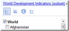
1) Google Public Data Explorer – World Development Indicators
Use the People Category, and looks for the data relevant to women in particular.
It is recommended to keep the tick box on for World. Use the different icons for line graph, bar chart, map and maybe scatter graph.
You could then click on individual countries as well to see how they compare to the world average.
This is an excellent resource for viewing (and creating) maps, and includes world data for gender empowerment and ‘occupation and income’ – see if you can find out how to make thoe most of this excellent resource.
Finally, if you are feeling very adventurous you could try this online mapping activity, but it is quite complicated. Follow the instructions carefully.
Some more tips on designing a good infographic
Some great tips for designing infographics:
- Keep it simple! Don’t try to do too much in one picture.
- Decide on a colour scheme.
- Research some great facts and statistics.
- Think of it as a visual essay: ensure your arguments hold and are relevant.
- Remember that it’s all about quickly conveying the meaning behind complex data.
- Draw conclusions.
- Reference your facts in the infographic.
Source: makeuseof.com
Ideas for infographic formats include:
- Timelines;
- Flow charts;
- Annotated maps;
- Graphs;
- Venn diagrams;
- Size comparisons;
- Showing familiar objects or similar size or value.
Source: makeuseof.com

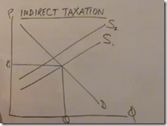
How does elasticity of supply and demand affect incidence of tax?
Nov 2nd
pajholden explains the effect of indirect taxation. Note he concentrates mainly on specific tax but includes a brief section on ad valorem (percentage) tax later on. Click below.
A much longer (and therefore detailed) video by jodiecongirl. Use these if you really haven’t yet understood the key concepts, as these will take you through it slowly and step by step.
She also goes into depth about the impacts on producers and consumers in the following videos but this gets quite complex. (more suited to IB level):
General Rules About Taxes Part 1
General Rules About Taxes Part 2
A much briefer summary is here by agsmandrew and he manages to explore the impact on consumer and producer surplus (including deadwight loss) (good for a quick revision for IB students):
Visit this site and explore different possibilities on a supply/demand graph with varying levels of tax applied. Try answering the questions at the bottom. (Note – the graph also refers to Efficiency Loss which is not actually required on the IGCSE syllabus, but is necessary to IB Economics).
![]() McConnell Brue Economics – Online Learning Centre – Interactive Graphing Exercise – Tax Incidence
McConnell Brue Economics – Online Learning Centre – Interactive Graphing Exercise – Tax Incidence
Price Elasticity of Demand
Oct 30th
Introductory Videos
Video: Price Elasticity of Demand – part 1 by pajholden
Video: Price Elasticity of Demand – part 1 by pajholden
Interactive Tutorials
Economics Interactive Tutorial by Samuel Baker (Univ of Carolina)
Elasticity — A Quantitative Approach by Samuel Baker (Univ of Carolina)
The Market System – Part 1 on biz/ed – contains section on PED towards end
Price elasticity of demand and basic application in Excel by Tushar Mehta
The following videos deal with the important concept of how price elasticity of demand relates to total revenue. They cover similar ground so you may not feel the need to watch all of them, but they do take different approaches in presentation.
Price Elasticity & Total Revenue by BrynJonesOnline
Total Revenue and Elasticity by ElmagicRonaldo
Elasticity and Revenue by jodiecongirl
Price Elasticity of Demand (PED) – own price elasticity by economicsfun
Good real life example on the determinants (factors affecting) Price Elasticity of Demand … ‘gasoline’ (or petrol):
In Summary
Price Elasticity: From Tires to Toothpicks (Econedlink)
Price Elasticity of Demand (tutor2u)
Price Elasticity of Demand (Welker’s Wikinomics)
Finally, before moving on to Price Elasticity of Supply, this 15 minute video explaining an unusual ‘spike’ in gas prices in the US in 2002, is excellent and highly recommended for applying the theory to a real life example (the latter part gets a little bit tricky, but still recommended for IGCSE and IB students):


