Geography

Describing Places Using Key Words and Google Maps
Jan 12th

Source: National Geographic (Education)
Watch this video. Afterwards, you need to describe the places that you have seen in the video, so watch carefully.
Q. As we describe the places we see, what sort of special words can we use? We are trying to use Geography key words …
Mini Norway – a Tilt Shift Movie from Davide Vasta on Vimeo.
Now we will do the same for a different place …
Bird’s eye Bangkok from Pieter Manders on Vimeo.
What Geography Key Words can we use when describing places?
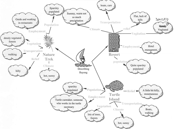
Putting it all together – here is how a student once applied such key words to three locations around Rayong in Thailand.
Regional Climate in Brazil
Nov 3rd
A resource suitable for Key Stage 3 students (aged 11 to 14 years) studying Brazil as a topic within Geography. Introduces the climate of Amazonia, centred on Manaus, through a ‘living graph’ activity and then provides a chance to create a climate graph, with instructions, of the coastal lowlands in South East Brazil.
Direct link to original MS Powerpoint file. (Microsoft Powerpoint 97-2003 format)
Comparing Two Regions in Brazil
Sep 16th
A resource suitable for Key Stage 3 students (aged 11 to 14 years) studying Brazil as a topic within Geography. The slideshow requires short video clips of Amazonia (North Brazil) and South East Brazil. I have referenced a BBC production called Brazil 2000 – Flightpaths (which is now somewhat dated), but other short video clips might easily be used to reflect some of the key differences between the dense coastal strip of South East Brazil and the sparse rainforest of the North.
Direct download (Microsoft Powerpoint 97-2003 format)
All The World’s Flights In A Day
Mar 22nd
This video (of which there are several copies on youtube) could provoke a lot of interesting questions. Where in the world receives the most air traffic? Why? How does this reflect historical developments? Does the spread of daylight hours affect flight concentrations? Which two continents / regions are the most connected by flights? Again, why? How does the perspective of a 2D map affect the apparent speed of flights in different parts of the globe? How else might this data be shown?
Thanks to my colleague Darren for passing this on.
Resources to Help Learners Understand the 2011 Tohuku Earthquake and Tsunami
Mar 19th
Almost all of these resources have been linked to by educators using Twitter, and should help learners to deepen their understanding of the disaster that occurred on 11th March 2011, and its aftermath.
Note on reliability: These resources were collected here on 20th March 2011 and so only include information available on or before that date – learners are advised to research for the latest updates as well, as the situation reported on in these links is always changing and a lot more information continues to be made available.
Excellent slideshow by Simon Jones providing questions to prompt thoughtful reflection by students learning about the disaster:
How Shifting Plates Caused the Earthquake and Tsunami in Japan: Interactive map by The New York Times helps explain the tectonic causes of the earthquake and tsunami.
Japan Earthquake 2011 Google Map provided by Google with many possible placemarks to explore on the left side of the map.
For Google Earth – ‘post-event imagery of several affected areas in Japan’ [View these files in Google Earth]
Striking before and after satellite imagery of various locations in North Japan hosted on the NY Times. Drag the slider from left to right and back to see the differences. A similar resource has been posted by the Guardian.
In pictures: Japan earthquake and tsunami – slideshow hosted on BBC website
Slideshow – Seven Days in Japan – 70 photographs each with a caption underneath.
Japan: the day after the earthquake and tsunami – in pictures – slideshow hosted on the Guardian newspaper’s website.
Factbox: Japan disaster in figures – published by Reuters on Saturday 19th March.
A graphic representation of the earthquake and resulting tsunami – useful to understand the causes. Provided by the National Post.
2011 Tōhoku earthquake and tsunami – Information collected on wikipedia.
Interactive map by the Guardian’s website, as at 16th March 2011 (note: information on nuclear risk likely to change quickly – learners are advised to research for the latest updates on this, as the situation has been continually changing).
JPquake Journalist Wall of Shame – Interesting ‘crowd-sourced’ wiki created by people concerned that some reports on the disaster contained bias, speculation, misinformation and sensationalism. This could be interesting to students of IB Theory of Knowledge, as well as other subjects.
100+ Teaching Resources About The Japan Crisis by edudemic.com – Several resources linked to above are also included in this very useful collection. The collection also provides a lot more links on the science behind the disaster.
A powerful video created by students at Yokohama International School:
Tohoku Japan Earthquake Awareness from 12ShirotsukaM on Vimeo.
The NY times has invited teachers to share ideas on how they and their students have been responding to the disaster. Recommended.
Japan Quake Map – Based on Google Maps, this is revealing, dynamic time-lapse map shows the sheer volume of seismic activity (earthquakes, pre-shocks and aftershocks) around North Japan beginning on the 11th March to current date (true at 31st March when this was updated).
Japan’s Earthquake & Tsunami: How They Happened – via openculture.com, a link to an informative 47 minute documentary

Can you drastically cut UK carbon emissions by 2050?
Mar 9th
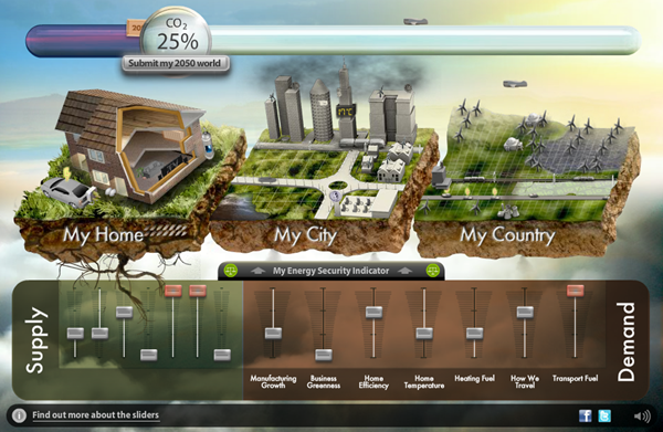
Could you take charge and organise changes in production and consumption to cut UK CO2 production in 2050 to 20% of 1990 levels?
This excellent interactive decision making exercise asks you to do just that. It has great potential in geography, economics, environmental science and more.
Interestingly, if you get it right (succeed in hitting the 20% target or lower), you can submit your ‘decisions’ and the Department of Energy and Climate Change will combine your data with all other submissions to help inform a debate about the kinds of “choices and trade-offs the United Kingdom faces to reach the 2050 emissions reduction target”.
Hit the link below:
Thanks to my friend and former colleague, Andy, for passing this my way.

The World’s Most Typical Person
Mar 7th
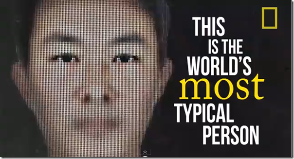
The world’s most typical person is male and in terms of the mode average ethnic group, is a Chinese, Han man. His age, in terms of median average is 28. The typical face shown above is built of 190 000 photos of 28 year old ethnic Han men. But as the video tells us, he won’t be the most typical person for long …
As World Population approaches 7 billion, NationalGeographic have created a brilliant infographic-style animation, complete with catchy tune and thought-provoking statistics. (There’s also a healthy qualifier in there – “typical is always relative”).
A great starter for population studies or even for discussions about global inequality, like the World Scaled Down to A Village of 100 idea. It might also have value in Theory Of Knowledge discussions of data and what we mean by ‘typical’ and ‘ethnicity’. There’s even a bit relevant to the economic concept of ‘needs and wants’ at the very end.
Packed full of cross-curricular uses, it is simply a ‘must see’.
Visions of Continental Drift on Fast Forward
Jan 12th
What would continental drift look like on extreme fast-forward. These video clips are partly based on science, partly imagination. The (pre)historical part of these videos are hopefully based on research by Geologists. The predictions beyond the present day can be no more than pure speculation (especially this one that envisages a pangaea (single land mass) once more … almost poetic …
This second one is confusing. Some good views of how continental drift might have looked, but then the predictions of the future seem to abandon continental drift altogether, as though that fundamental process stops altogether, and switches entirely to speculation of how today’s static continents would look if sea levels continue to rise to new, extreme levels. On that basis, the title ‘Earth 100 Million years From Now’ is disappointing – where’s the continental drift gone? Sea level fluctuations would most likely be cycling rapidly (in such a geological timescale) both up and back down. Misleading, therefore, but interesting for the early section …

Settlement Functions
Dec 11th
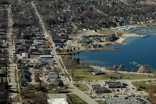
Image: Some rights reserved by Odalaigh
Theory 1:
Explore the first button on this flash animation:
Mr D Geography on Settlement Function
Theory 2:

The Rural Urban Fringe
Dec 11th
Image: Some rights reserved by Aaron Villescas™
Using thorough research (referring to web sites, text book(s), and your own notes (including any notes on relevant videos you have watched)), answer the following questions:
1) What changes are taking place at the Rural Urban Fringe as a result of urbanisation?
Make sure you refer to:
- urban sprawl
- counterurbanisation
- recent developments
It is worth structuring examples of recent development at the RUF as part of your answer. For example:
- Residential function: commuter villages / "suburbanised villages"
- Industrial function: New high-tech industry – especially Science Parks [example: Cambridge Science Park, UK]
- Retail function: Recent Out Of Town Shopping Centres [example: Merry Hill, UK]
2) What are some of the main advantages of these changes (developments)?
3) What are some of the main disadvantages of these changes (developments)?
4) What are some of the solutions to the problems caused by overdevelopment of the Rural Urban Fringe?


