Posts tagged lesson

Describing Places Using Key Words and Google Maps
Jan 12th

Source: National Geographic (Education)
Watch this video. Afterwards, you need to describe the places that you have seen in the video, so watch carefully.
Q. As we describe the places we see, what sort of special words can we use? We are trying to use Geography key words …
Mini Norway – a Tilt Shift Movie from Davide Vasta on Vimeo.
Now we will do the same for a different place …
Bird’s eye Bangkok from Pieter Manders on Vimeo.
What Geography Key Words can we use when describing places?
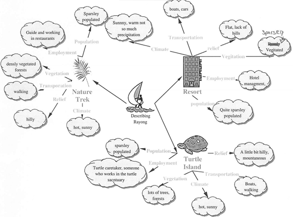
Putting it all together – here is how a student once applied such key words to three locations around Rayong in Thailand.

Create an Infographic for Millennium Development Goal 3
Nov 7th
What is an infographic?
It is a visual way of showing information (data) data so that it is easy to understand. They help to explain complicated information clearly and quickly.
An infographic can be a video or a picture (like a poster).
Here is a video infographic explaining the 8 Millennium Development Goals and why we need them. Watch it and notice how simple but good-looking graphics are used to show the information. .
You probably agree that the information can be easier to understand this way than if you were reading it in a piece of text or if you were looking at tables of numbers.
If you want to understand more about the Millennium Development Goals and see more video clips like this, visit this page.
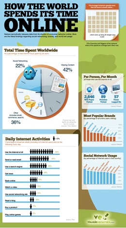
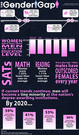
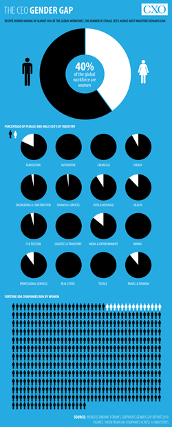
Here are some still-picture infographics which are more like posters. They are not all to do with the third Millennium Development Goal, but they are good examples. Click on them to see bigger versions.
Notice how pictures, colour, numbers, text, graphs and diagrams are blended in a simple to read and interesting way.
Sources: History of Women in Workplace
How The World Spends Its Time Online
Your Task
Your task is to create an infographic which tells people about gender inequality around the world. It probably won’t be as detailed as the ones above (some of these professional infographics take several months to create) but making it should hopefully be an interesting way of understanding some of the facts about gender inequality.
It is recommended that you create graphs using MS EXCEL, using the files listed under ‘Raw Data’ below. Try to make them visually appealing through clever formatting. There is also some interactive software listed below which you could use to make maps (you may need to take screen shots [Print Screen] of the maps once you have created them).
You can find images to help your infographic online. You should always give the sources of images and data at the bottom of your infographic.
It is up to you what software you use to put the images, graphs and text together but I recommend MS Publisher or using just one slide in MS Powerpoint (this is probably the simplest way).
What is gender inequality?
There are many was that men and women are not equal in today’s world and here are some things to look out for when designing your infographic:
- What % of girls go to school? How does that compare to the % of boys who go to school?
- What % of women have a job? What sorts of jobs do they mainly do? What % do not work in faming? How does this data compare to men?
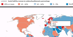
- What % of politicians with a ‘seat’ in parliament are women?
- How long are females expected to live on average? (What is their life expectancy?) How does this compare to males?
- How many girls die before their first birthday? (What is female infant mortality?) How does this compare to boys?
- Where do different countries rank on the global gender gap index (explained here).
Processing The Data
Now you need some data on gender inequality to ‘process’ into your infographic.
Raw Data – Data that needs to be converted into graphs by you in EXCEL (or similar)
Visit these sites to access the data in EXCEL files and use it to create graphs, charts and images which you can then put into your infographic. It is up to you what software you use to build the infographic itself. You don’t need to use all of these files.
EXCEL file on MDG 3 from unicef
EXCEL file on MDG 3 from adb.org
EXCEL file on Global Gender Gap Index
EXCEL file on Human Development Report Data by UN (2010) – use table 4 (tab at the bottom)
EXCEL file (big) on World Health Statistics 2009 (WHO) – use tabs 1 and 9
Interactive Data – Useful data that you can process online :
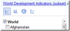
1) Google Public Data Explorer – World Development Indicators
Use the People Category, and looks for the data relevant to women in particular.
It is recommended to keep the tick box on for World. Use the different icons for line graph, bar chart, map and maybe scatter graph.
You could then click on individual countries as well to see how they compare to the world average.
This is an excellent resource for viewing (and creating) maps, and includes world data for gender empowerment and ‘occupation and income’ – see if you can find out how to make thoe most of this excellent resource.
Finally, if you are feeling very adventurous you could try this online mapping activity, but it is quite complicated. Follow the instructions carefully.
Some more tips on designing a good infographic
Some great tips for designing infographics:
- Keep it simple! Don’t try to do too much in one picture.
- Decide on a colour scheme.
- Research some great facts and statistics.
- Think of it as a visual essay: ensure your arguments hold and are relevant.
- Remember that it’s all about quickly conveying the meaning behind complex data.
- Draw conclusions.
- Reference your facts in the infographic.
Source: makeuseof.com
Ideas for infographic formats include:
- Timelines;
- Flow charts;
- Annotated maps;
- Graphs;
- Venn diagrams;
- Size comparisons;
- Showing familiar objects or similar size or value.
Source: makeuseof.com
Population Pyramids – Part 1
Sep 23rd
Before moving on it is worth recapping the Demographic Transition model:
Now we compare population structures (also known as age-sex structures or ‘population pyramids’) between MEDCs and LEDCs. The following animation should make sense before moving on:
BBC Scotland Education Population Pyramid Flash Animation
Now download the following worksheet and follow the instructions:
Worksheet – Population Pyramids on the Net
Now visit here and repeat the quiz until you can score full marks:
http://www.geography.ndo.co.uk/populationmatch.htm
Putting it all together – watch this:
You should also be able to complete the second set of tasks (already introduced in the Demographic Transition Model post) – click on the Part 2 tab and check your Answers before moving on – not there are three pyramids to analyse.
http://www.ngfl-cymru.org.uk/vtc/demographic_trans/eng/Introduction/plenary.swf
Review:
Read the following pages carefully. Add notes where appropriate.
BBC Bitesize for Population Structure Revision [1]
BBC Bitesize for Population Structure Revision [2]
At the bottom of the last page you can take a test bite.
Dependency Ratios
This module helps with our understanding of dependency ratios:


